Fall 2020 One Room Challenge Weeks 6-8: Modern Updated Office Renovation Final Reveal
Well believe it or not, we actually made it through our second One Room Challenge and finished the office of my daughter’s dreams in six (seven!) weeks. Almost on time even though I didn’t have a lot of time throughout the ORC due to work projects and had to make a huge push to finish, but we are done!! My daughter has moved back in and it is much brighter, lighter and fun for her to work from that space. It’s sexy according to several people in the know; both my photographer Erin Comerford and my stylist Kendra Surface were on the sexy train and I had to agree with them!!
A huge thank you to Linda from Calling It Home and Better Homes and Gardens for sponsoring the One Room Challenge! I would not have been able to transform the office without participating as a guest in the ORC! This was my second time participating and now both of my girls have rooms they love!! If you haven’t already, be sure to check out the Featured Designers and the other Guest Participants!
Let’s revisit what we started with. Yep, it was pretty sad! The office was dark and didn’t have adequate lighting. My ex-husband didn’t really want any light in the room and didn’t want me to update anything. Ciara really didn’t like that the room was so dark and was not functional for her working from home. So some built-ins and a little electrical work definitely brightened and updated the space for her.
Before: Dated Home Office
If you are just visiting, here is a recap of the previous weeks.
Ok, so let’s get to the reveal!!
After: Soft, Neutral, and Modern Home Office
Photography by Erin Comerford
Can you believe it??!! It doesn’t even look like it could be the same space! We are so in love with everything about it and how it turned out! The biggest change to the room are the built-ins. Not only does the color make them dramatic, but they provide a ton of storage and function. My carpenter built them and we did the finish work on them. I painted them in Benjamin Moore’s Advance Interior Alkyd in Deep River. It’s a moody green with a black base. We actually thought that it would read darker in the room and we would see less green but it’s a gorgeous, rich color and we love how it pairs with the Benjamin Moore Aura Matte Paint Candle Light on the walls! This room just glows now and the rich color of the built-ins grounds it all.
Photography by Erin Comerford
Photography by Erin Comerford
Photography by Erin Comerford
The desk is vintage and I bought it here in Charlotte for a project we didn’t use it for from South End Exchange. I find great vintage items from these shops to mix with new pieces to create really customized spaces. The desk didn’t have a back and was going to be a problem to float in the room, so I had to think through how to fix that problem. A little trim and custom panel upholstered in Kravet’s Celine Faux Leather and you would never know it wasn’t meant to be that way!!
Photography by Erin Comerford
Since we needed to introduce more light into the space, I had my electrician pull wires for a ceiling fixture and library sconces. The Cabinet Maker’s Picture Lights are great during the evenings for a little mood lighting and the gorgeous Circa Beckham Modern Chandelier provides a lot of light on cloudy days and in the evenings when we need more light, especially now since it’s dark at 5pm!! The large botanical print inside of the built-ins was a file of a vintage print I found online and sent to a local printer. I had it mounted to foam core and had it framed at my local frame shop. We love it!! Such a beautiful accent to the office space! The cabinet hardware came from Anthropologie, I let Ciara pick what she wanted and she loves it. Ciara wanted gold desk accessories so we found them all at Target! Perfect and so much better than a mismatched set of office tools.
Photography by Erin Comerford
We downloaded a lot of the prints on the gallery wall and framed them in ready made frames that we liked from local stores. Moth Print, Picasso Print, Magnolia Print, Abstract Small Print, Landscape Print, Modern Art Print (lady), Black and white Blossom Art, Black and White Abstract art, Fringe Mirror. The large landscape was also printed at a local print shop and framed at my frame shop as well. It’s the perfect juxtaposition with the modern art and plays really well with everything else. I’ve had the ram head for years and honestly it’s never found a home. It didn’t feel right anywhere I tried it so to storage it went and when we looked at a skull head Ciara had and discussed painting it, I remembered I had the ram head in storage!! Lucky happenstance and he looks perfect with everything else in the gallery!! We pulled out accessories we had around the house that I already had, found some antique and vintage pieces and bought a few new things. We collect a lot of older books and volumes, so we’ve had most of the books we used in here.
Photography by Erin Comerford
Photography by Erin Comerford
Photography by Erin Comerford
Photography by Erin Comerford
Don’t you love the bar cart!? It was another vintage find here in Charlotte from Slate Interiors and I bought it for Ciara with the thought that it could house her massive collection of plants that seem to take over the house. I am more of a minimal plant person since I can’t seem to keep anything alive for very long, but my girls love plants and have made quite the hobby out of knowing how to take care of them. I think she likes having a bar in the office though for her Friday happy hour Zoom meetings so the plants may take a back seat to the margaritas!! And well for Kendra, Erin and I, the pink champagne is sexy so I’m sticking with that!! The drapes were something that Ciara found and fell in love with as well. I don’t usually use ready made drapes in my house, but I would not have been able to get the border on a pair of custom drapes for a reasonable price and they were perfect for the aesthetic of the space. The Sherpa Side Chair was a simple solution to have a seat that Sophia or I can sit in for a quick minute when Ciara has a work break or on the weekends maybe. Not everything has to be expensive to pull a great looking room together. I have a lot of places where I tell clients they need to spend their money and places where they can save and I apply those same rules to my home as well. Will that side chair be super comfortable and long lasting? Probably not, but it won’t get a lot of use so it works for the purpose we need it for. To provide a place for someone to sit for a bit and have a chat. I think I may just find myself sitting in there chatting on our lunch breaks when I am working from home!!
Photography by Erin Comerford
Photography by Erin Comerford
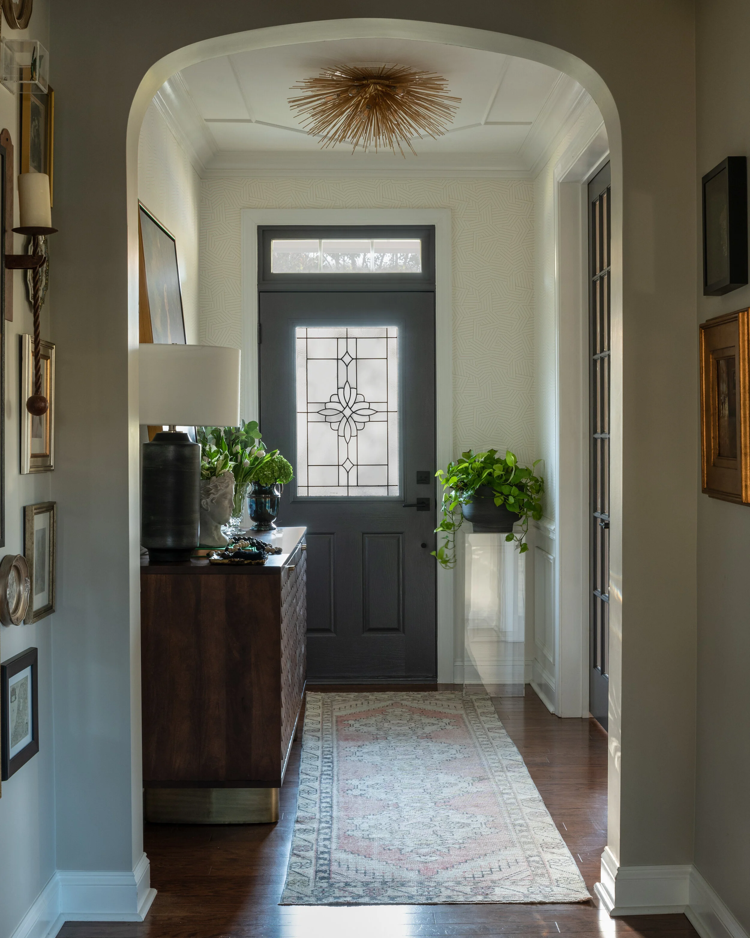
I had not planned on finishing the foyer which is right outside Ciara’s office, but once we had the office plan in place and the doors were getting painted, it was crazy not to paint the front door and replace the lighting there as well. I had hung new lights when we moved into our house over eight years ago, but they’ve needed to be replaced again for several years. I couldn’t decide what I wanted and of course, again, cobbler here!!
Photography by Erin Comerford
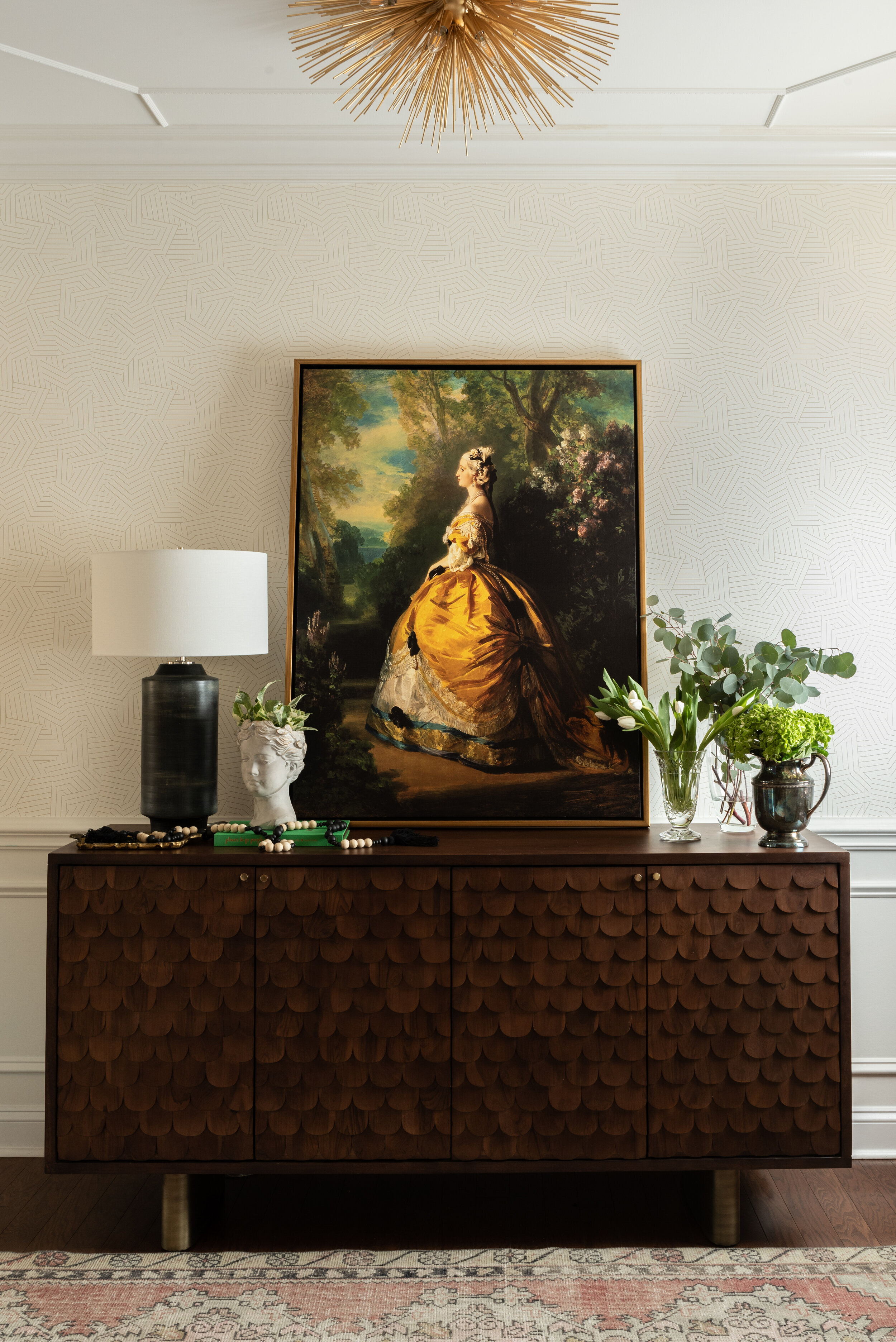
I have loved the elements I already had in the foyer, but it wasn’t completely finished. The moulding was added about seven years ago to lay the foundation for the foyer space. I then wallpapered the foyer several years ago with Schumacher’s Deconstructed Stripe. It was subtle enough to provide texture and a great backdrop to the console from Union Home, one of my trade vendors. I love the clean lines of the wallpaper with the more rustic Indian carved scallops on the console doors. I was looking forever for a painting that would speak to the the space and set the tone for the rest of the house. It takes me time to find pieces for my home since I know I will live with them for a long time and interior designers are their own worst client and I can’t live without color in my life.
Photography by Erin Comerford
I fell in love with this painting of Empress Eugenie about two years ago. That yellow, it had me at hello!! And the other colors feel like they have light coming out of them and it makes me happy every time I see it!! I also leave a lamp on at night in the foyer and wanted something to help ground the space. The patina on the Regina Andrews Dayton lamp was a perfect juxtaposition to the classical painting!
Photography by Erin Comerford
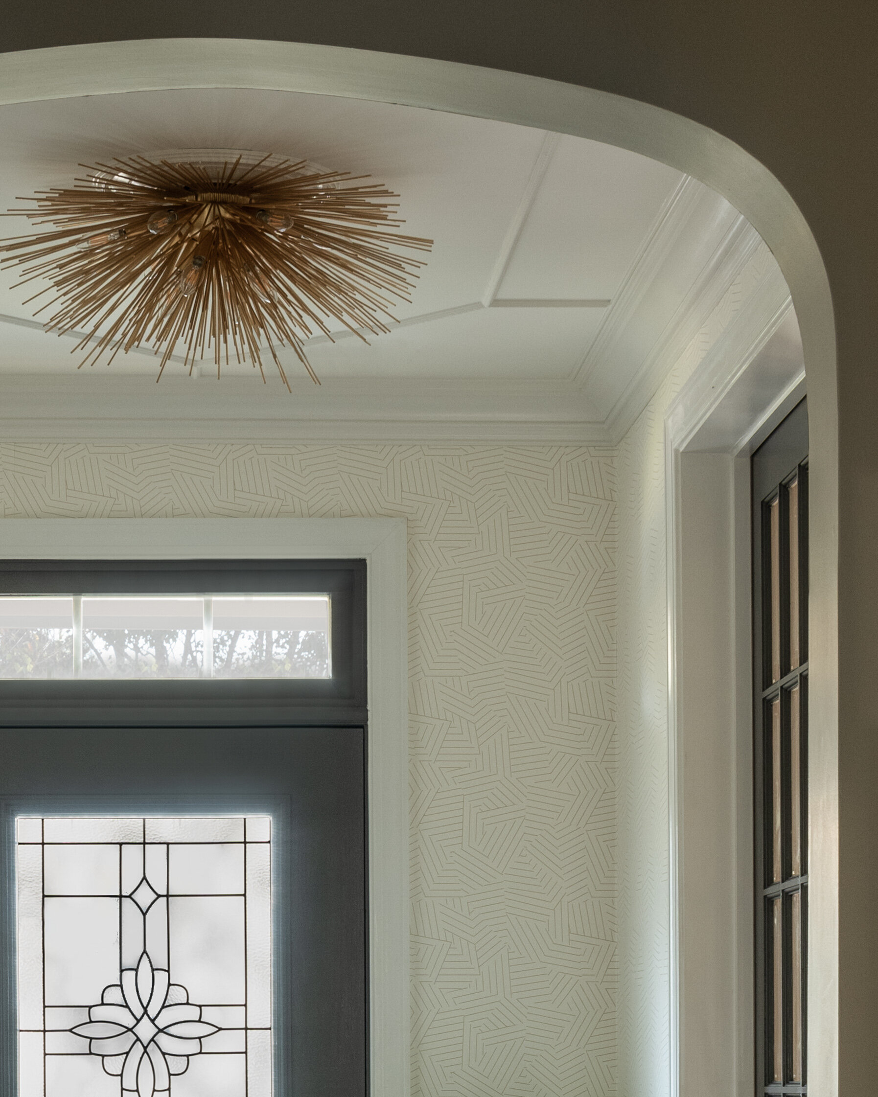
The runner is from Rug Lords here in Charlotte and had the perfect blush color I was looking for. That was another find that took me awhile to search for as well! Creating a collected space can take time and there is nothing wrong with waiting until you find the perfect thing that speaks to you! The ceiling fixture needed to be something modern that I was crazy about, that I could look at and just have goose bumps every time I see it. Well, I love the new Strada Circa Lighting fixture! The brass works well with the other brass details I’ve had in the house for the past seven or eight years and of course works well with the other elements in the foyer. The only other thing that was missing for me was the doors needing some paint. So that’s what they got! Sherwin Williams Peppercorn helped to create a little drama and it completely changed the way the entire space feels! I seems silly now that I put off painting them for years, but I did. But, it’s done now!! Now when I walk into the front of our home, it feels like us. That’s what I want for my family. It’s also what we spend months planning with our clients on their construction and interior projects.
Photography by Erin Comerford
Photography by Erin Comerford
Well that’s all I’ve got friends! I hope you enjoyed the reveal of Ciara’s office space (I’m a little jealous, I may have to redo my office next!) and our foyer. If you are just stopping by for the first time, follow us on Instagram and keep up with our projects! My team and I would love to have you join us!!


